
Learn everything about color theory and color wheel in Graphic Design to combine colors to create harmonious design projects.

Color theory for designers
Color is one of the most important
elements in graphic design. It has the power to influence our moods and
emotions whether you're creating print materials, online ads, or logo designs.
Using color theory can help you control the message your audience receives as
well as create a cohesive brand image across all of your marketing materials.
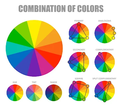
The color wheel is a tool used by
designers to make sense of color. It tells us how colors relate to each other
and can be used to figure out complementary colors, split-complementary colors,
analogous colors, triadic colors, and more!.
what
are the principles of color theory in graphic design?
we will learn the importance of color
in graphic design in the following points :
- Color theory basics
- The color wheel
- Complementary colors
- Triad colors
- Monochromatic colors
- Analogous colors
Color Theory For Designers: Color Theory Basics
Every color contains a range of
emotions. The right use of color can make your page content more attractive,
and it can even draw in more conversions. Knowing how to apply color theory to
your website can mean the difference between success and failure.
Before you can fully appreciate the
power of color on a page, you need to understand how brands use color
psychology to captivate customers. In this guide, we’ll go over the basics of
color theory, examine some brands that use it well, and show you how to apply
color theory to your own designs.
Color Theory in graphic design: The Color Wheel
The color wheel is a tool used in
the design industry to choose harmonious colors for a project. The wheel is
divided into warm and cool colors, and each section of the wheel is broken down
into three smaller sections that can be used to create even more shades.
The majority of the wheel consists
of primary colors, which are all at equal distance from each other. The primary colors are red, yellow, and blue. These three colors mix together to form
secondary colors.
Secondary Colors: Orange, Green, and
Purple
The wheel is divided into warm and
cool colors, and each section of the wheel is broken down into three smaller
sections that can be used to create even more shades.
Understanding color theory in graphic design: Complementary Colors
Complementary colors are those that
lie directly across from each other on the color wheel. When you place one
color next to its complementary color, they stand out dramatically and grab
your attention.
Complementary colors have a special
relationship that is more than just being opposites on the color spectrum. In
fact, when complementary colors are placed next to each other, their intensity
increases dramatically. This is known as the “complementary contrast effect” or
“afterimage effect”.
I’m sure you’ve seen or heard of
the color wheel before, so here is a quick look at it:
As you can see, complementary
colors are across from each other. This means that if you want to design using
complementary colors, you will have to choose one to be your dominant color and
one as an accent color.
Color Theory : Triad Colors definition graphic design
The idea behind Triad colors is
that you can use a combination of three colors to create one color. For
instance, if you want to make red, you would use red and orange.
Triadic color harmony is
psychologically pleasing because it creates balance and a feeling of stability,
but also visual intrigue.
Unlike complementary colors, which
always appear vibrant and dynamic, triadic colors have a more muted and
peaceful appearance. (This effect may be lessened if the triadic color palette
is too bright.)
Color Theory For Designers: Monochromatic Colors
Monochromatic is the use of single
base color and all its shades. It is one of the easiest yet most effective ways
to create a unified look for your home. Most people who decide to go with this
style opt for white or grey as their base color, and then add accents with
other neutral colors, such as brown and beige.
To pull off this look in your
place, you need to establish a cohesive color palette that includes white and
some other neutrals, like beige and gray. The key is to add splashes of
contrasting hues to liven things up; different shades
Analogous Colors
Analogous colors are the colors
located directly next to each other in the color wheel. They are best used for
accent or low-visibility color schemes and can be combined for a very pleasing
effect, much like complementary colors.
Using analogous colors is a good
way to create color palettes for designs that you want to look professional,
yet not too bold. Analogous colors also work well together as they create a
smoother transition between each end of the spectrum. Since they are all
located near each other, it's easy to create seamless transitions in between
them.
Conclusion: To wrap up this post,
let’s review the basics of color theory psychology.
